Monster Pops Brand & Packaging
The Big Idea
THE APPROACH
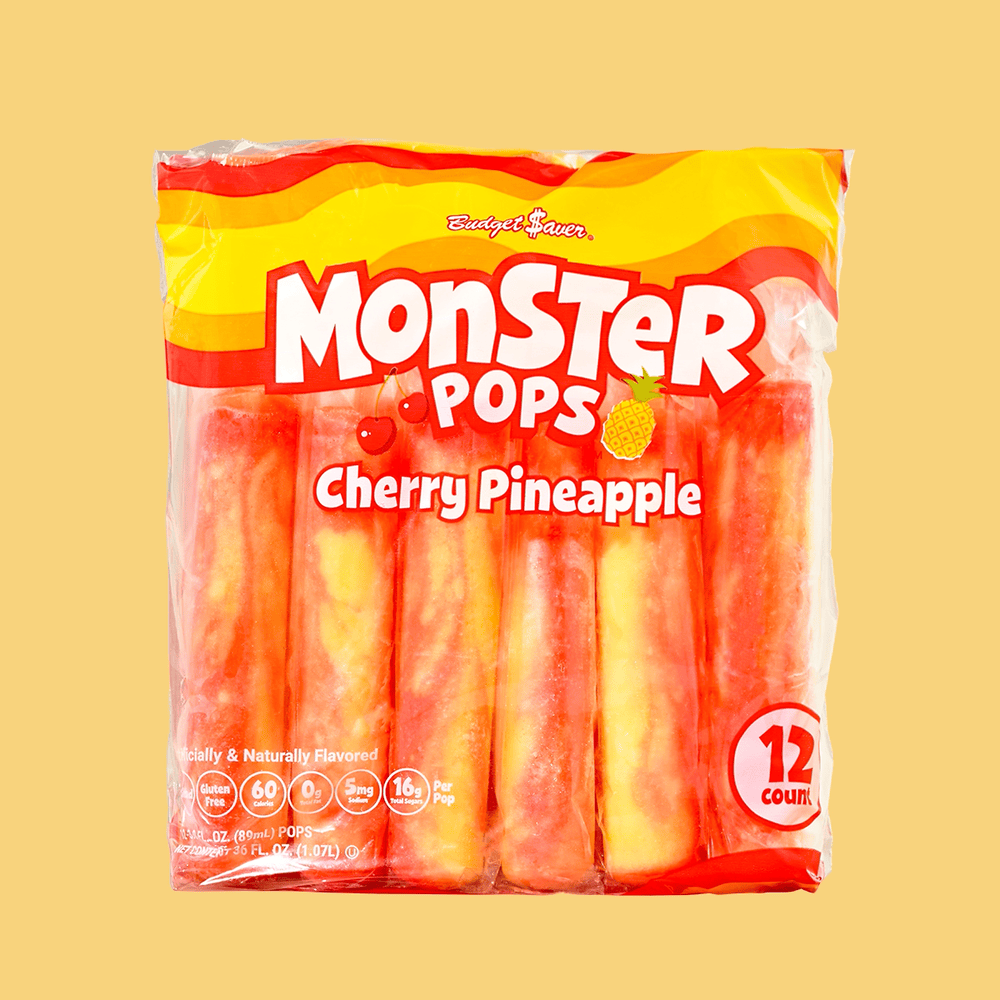
Budget$aver’s Monster Pops were long overdue for a makeover. We wanted to give them a colorful look that still showed off the swirled popsicle within their iconic clear bag.
The Service
THE WORK
Branding - NEW Monster Pops Logo
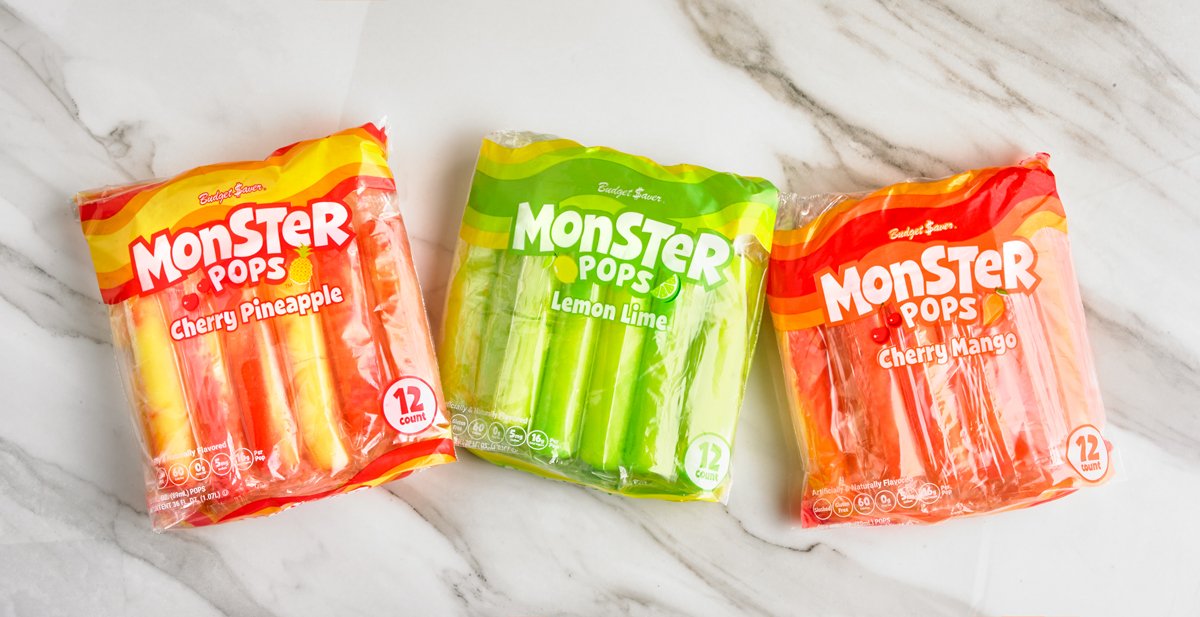
Packaging - 7 bags and a template for new flavors
Branding
clean & fun
Building a brand system for Monster Pops that seamlessly integrated with the pre-established Twin Pops sister-brand was an exciting challenge. Developing a versatile foundation for all flavors across various channels allowed for consistent yet adaptable branding—a project I'm humbly proud to have tackled.

New Brand System

Previous Packaging & Logo
Packaging
all about the swirl
Monster Pops are kind of a BIG deal. In fact, they are 55% larger than competing single-stick pops. The original packaging, however, covered most of the product which hid the size and also exciting swirl of color in each pop. The opportunity arose to creatively solve a few questions: How can we use the packaging to highlight the size and swirl of Monster Pops?
The result was to swirl the colors of the pop into the packaging and remove any needless elements to create a clean, visible bag that showcases just how huge of a deal Monster Pops are.